UX Experiment: My Ideal YouTube Home Feed

Photo by Henry Ascroft
“With thousands of videos to choose from, how can YouTube better curate recommendations according to my mood?”
I spent a lot of time on YouTube. It’s modern-day TV - personalized entertainment, education, music, movies, sports, and more rolled into a single platform. I love that I can watch videos on just about anything, which leads me to countless late nights sitting in bed scrolling and consuming so much random media. That’s great for YouTube (all that watch time and ad revenue), but personally I wish YouTube’s video curation was less distracting.
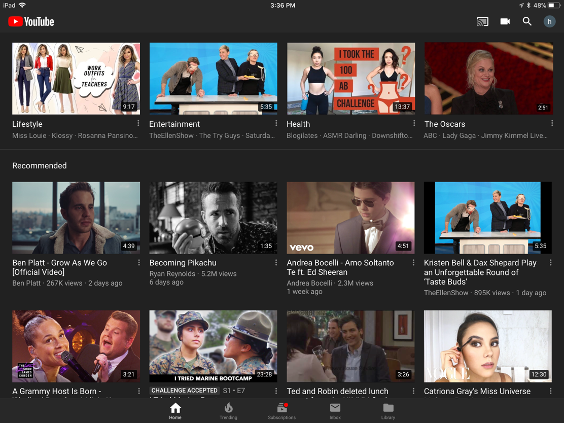
99% of the time I find all the videos I want to watch through the home feed. I’ll come home from work and want to relax and put on some entertainment. However, the enormous amount of options available is overwhelming. Sometimes I just want to laugh, and not get recommendations for serious thought-provoking psychology videos. Sometimes I want feel inspired to improve my productivity, not spiral down a rabbit hole of Ellen videos. I watch a range of different genres, from cooking, workout, TV show clips, comedy sketches, music videos, viral content, long form short movies, ASMR… the list goes on. There is one single dynamic home feed, and sometimes I just want to hit clear history and refresh the whole thing because the recommendations are far from what I want to watch at the moment. I often think about the channels I subscribed to five years ago, wondering what ever happened to them. They’re still making videos but I never see them on my home feed. Going into the chronologically-listed subscriptions doesn’t help either, because I subscribe to over 300 channels, including TV shows that upload dozens of videos daily. It’s too much to scroll through.
Back in the day, I remember YouTube’s home feed to be subscription-based. I’d see all my favorite YouTubers with their most recent videos and catch up on each of their channels. However, now it seems like the algorithm only surfaces videos related to my recent watch history, which is helpful at times, but also not, when I want to turn my attention to something else. I wish there was an option to organize my home feed recommendations by genre.
I tried drawing a mind map to visually organize the categories of videos I like to watch.

If I were to try to categorize the most common genres of videos I consume, they would be:
Lifestyle (cooking, vlogs, beauty, fashion)
Entertainment (TV, music, comedy, shorts)
Health (cooking, ASMR, workout, yoga)

Here is a basic layout of how I’d lay out my reorganization of the home feed. The top row would be my genres, either determined by me or an algorithm. I’d be able to change the available categories in my subscriptions tab, and drag channels I subscribe to into their respective buckets. The 4th genre would be dynamic and determined by YouTube. It can be a Topic that’s trending, recommended for me, pop culture-related, a timely event (e.g. elections or The Oscars), or just default to the user’s Watch Later or Favorites list.
Back to the home feed. When I click on any of the top row genres, it re-filters all the all the recommended video carousels on the page to the genre I selected. For example, when I click on “Entertainment”, my Entertainment-filtered channels (TheEllenShow, The Try Guys, Saturday Night Live, etc) show up and all the carousels below are filtered to Entertainment. Recommended channel carousels would still work the same way, except that they should all be filtered by “Entertainment.” Recommendations are determined by popularity, trending-ness, and upload time.

To me, a page like this allows me to easily find the new videos I’d like to watch from YouTube channels I watch the most. It doesn’t hide less frequented channels in the depths of my Subscriptions list, and allows me to determine the mood I want to be in when I consume my YouTube videos, whether it’s to laugh, to be inspired, or to learn.
Of course, I don’t actually know how YouTube determined how this feed is put together from their end and the technical and business-facing parameters; I’m sure there’s a reason they did it this way. This is just my opinion from a strictly user perspective and a simple design experiment. It might not be great or very thought through, but it was a fun afternoon thinking about the UX and challenging myself to come up with a solution instead of just complaining like usual.
Other related notes/questions/ideas
Redesigning the Subscriptions page so channels can be filtered by genre.
How useful is the Inbox? I wonder if people browse recommendations in list form, or even trust recommendations in general.
I really like the icons on top of the Trending page. It’s similar to my “organizing content by genres” concept. Maybe there’s a way we can list out all four categories in vertical columns so you can easily glance at and scroll through all 4 categories of videos without being redirected to another page?
Why does a video stay in the Watch Later list if I’ve finished watching it? I’d expect it to work like a music player queue. When it is watched it disappears from the list. If the user wants to find it again it will be in watch history.
Is there a way I can change the Up Next video suggestions to be ones related to my current video? I’d like a toggle option to view “related to by current video” recommendations versus “recommended for me” recommendations. Currently it’s a little bit of both combined and it’s confusing and not helpful for Autoplay.
Expanding on this idea
I would love to be able to apply an organization feature like this to my internet browser as well. Forever the person with 68 tabs open, I need to be able to transition from “work and design research” mode to “shopping products comparison” mode to “trending news article-reading” mode easily without crowding up my browser tabs and bookmarks. More on this another day…