Design Audit: Social Safety Net

These last few months I’ve been spending time every week volunteering with Code for America. During a place and time where I feel often helpless about the state of our nation, it’s comforting to be an active member of a community and try to use my unique skills to make an impact. As a designer in this world I feel like it’s my responsibility to make things easier for people, especially those less privileged than I am.
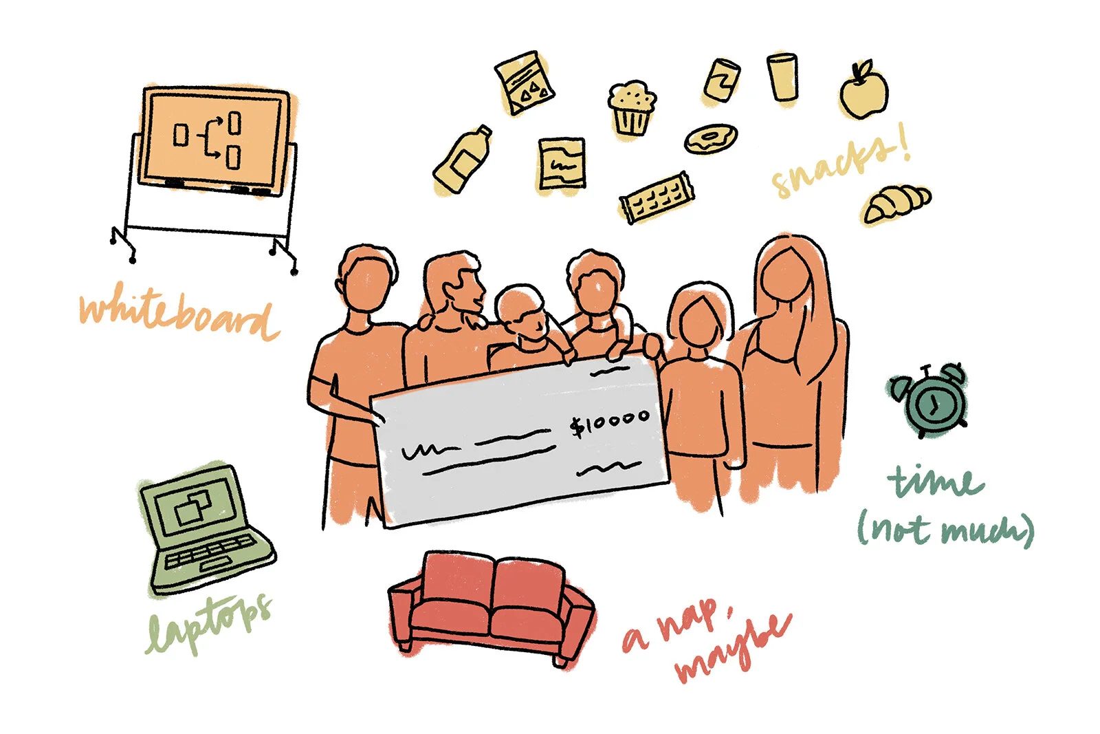
Last weekend I participated in the annual National Day of Civic Hacking, a Code for America-sponsored event that brings together volunteers from across the country to partner with local government and community groups to tackle some of our toughest challenges. This year’s very fitting theme was to help those most in need of social safety net services during COVID-19. I chose to complete a design audit for my state’s benefits applications.
After completing the task, I couldn’t stop there. The audit findings were compiled and sent off to the state agencies, but I took it a step further. Advocacy is great and I trust that legislators will find value in our findings and recommendations, but as a designer I’m naturally inclined to solve problems. So I made it my personal project to work on a whole new proposed redesign.
The Audit
Prompt: Many of today’s online benefits applications are long, visually cluttered, and challenging to understand. The resulting user experience can create significant barriers to accessing critical safety net benefits. Completing a Design Audit will help visualize and document the strengths and weaknesses of your local benefits applications. The goal is to create a relatively objective evaluation that can give state and local agencies a foundational understanding of what improvements to prioritize.
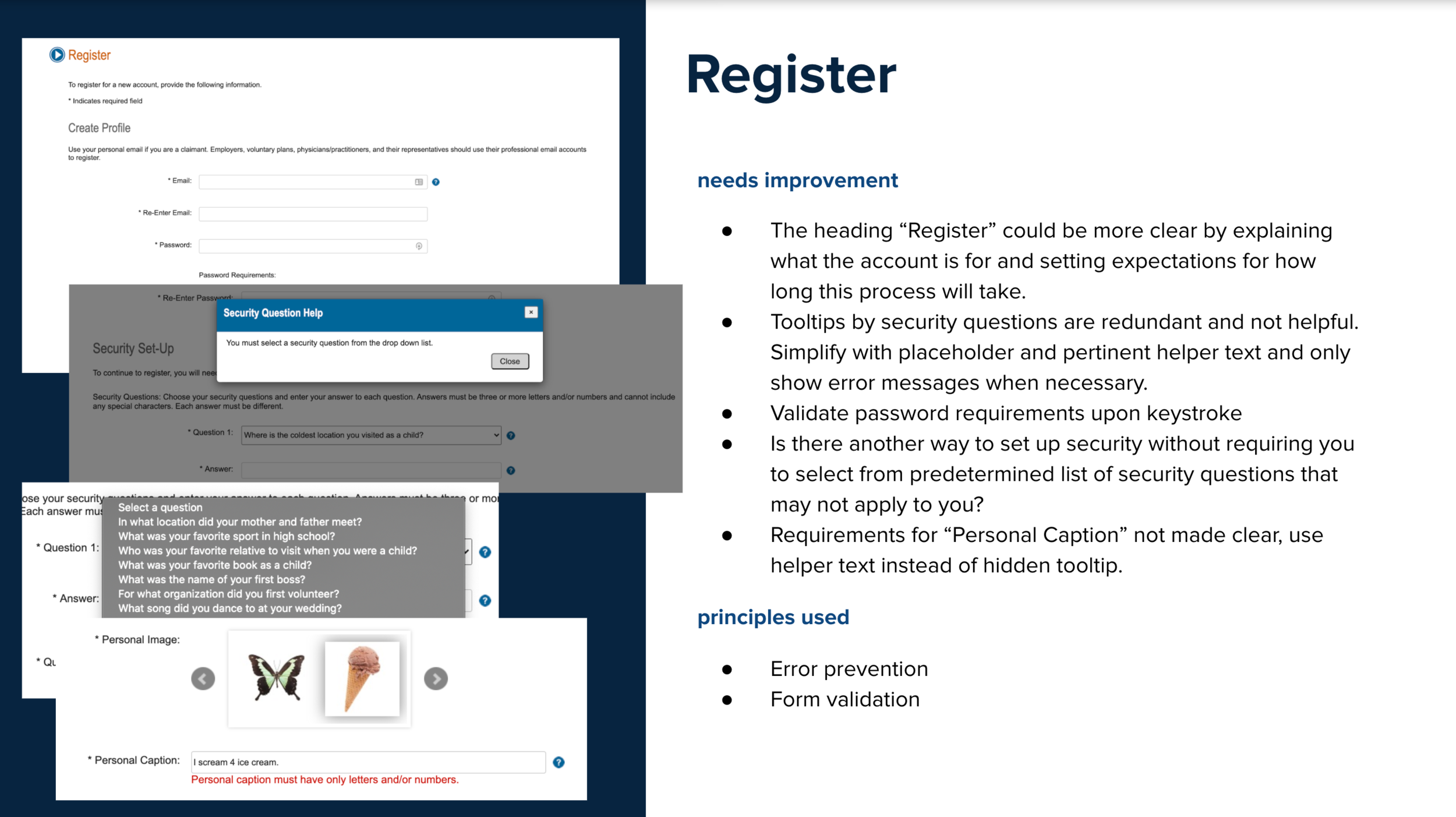
Our working session was about two hours long, during which I went through California’s EDD Unemployment Insurance application screen-by-screen, evaluating each step of the application process against design principles and noting areas that needed improvement. I assessed the user flow as well as the UI based on principles of information architecture, consistency, control, error prevention, and visual hierarchy.
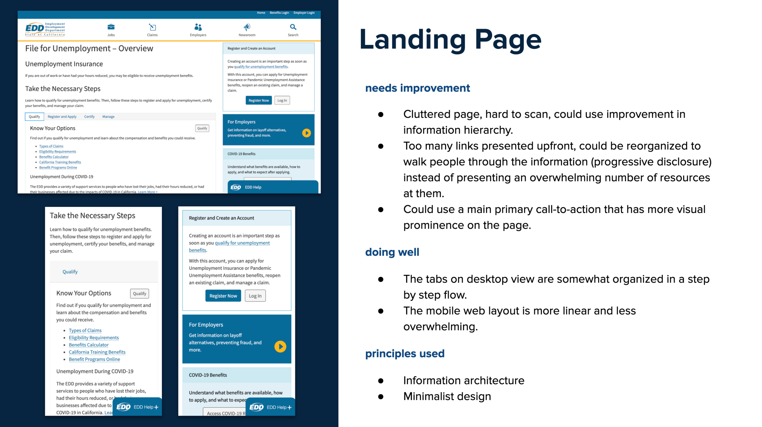
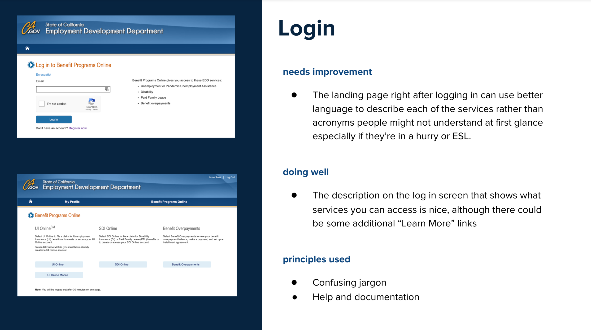
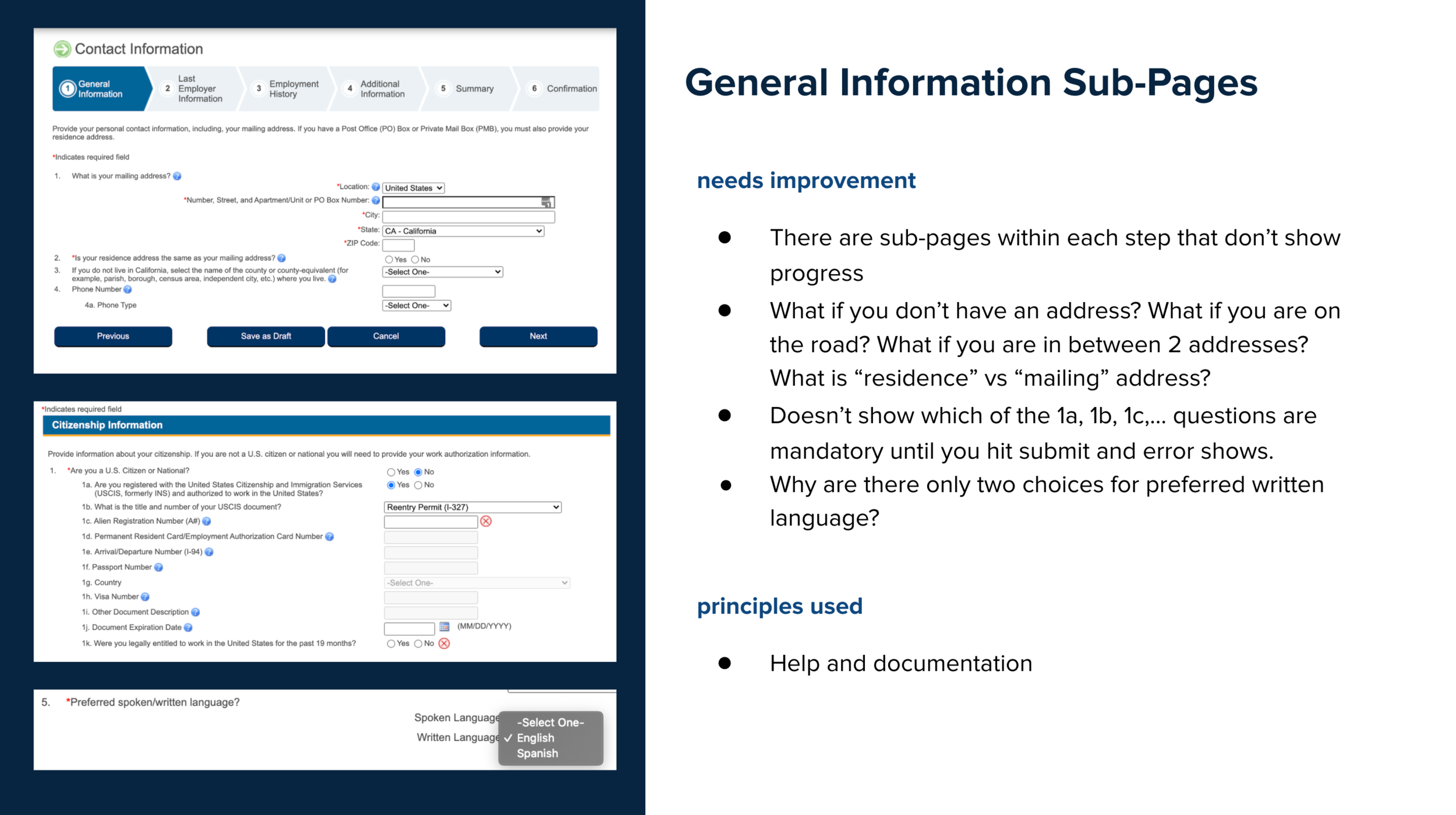
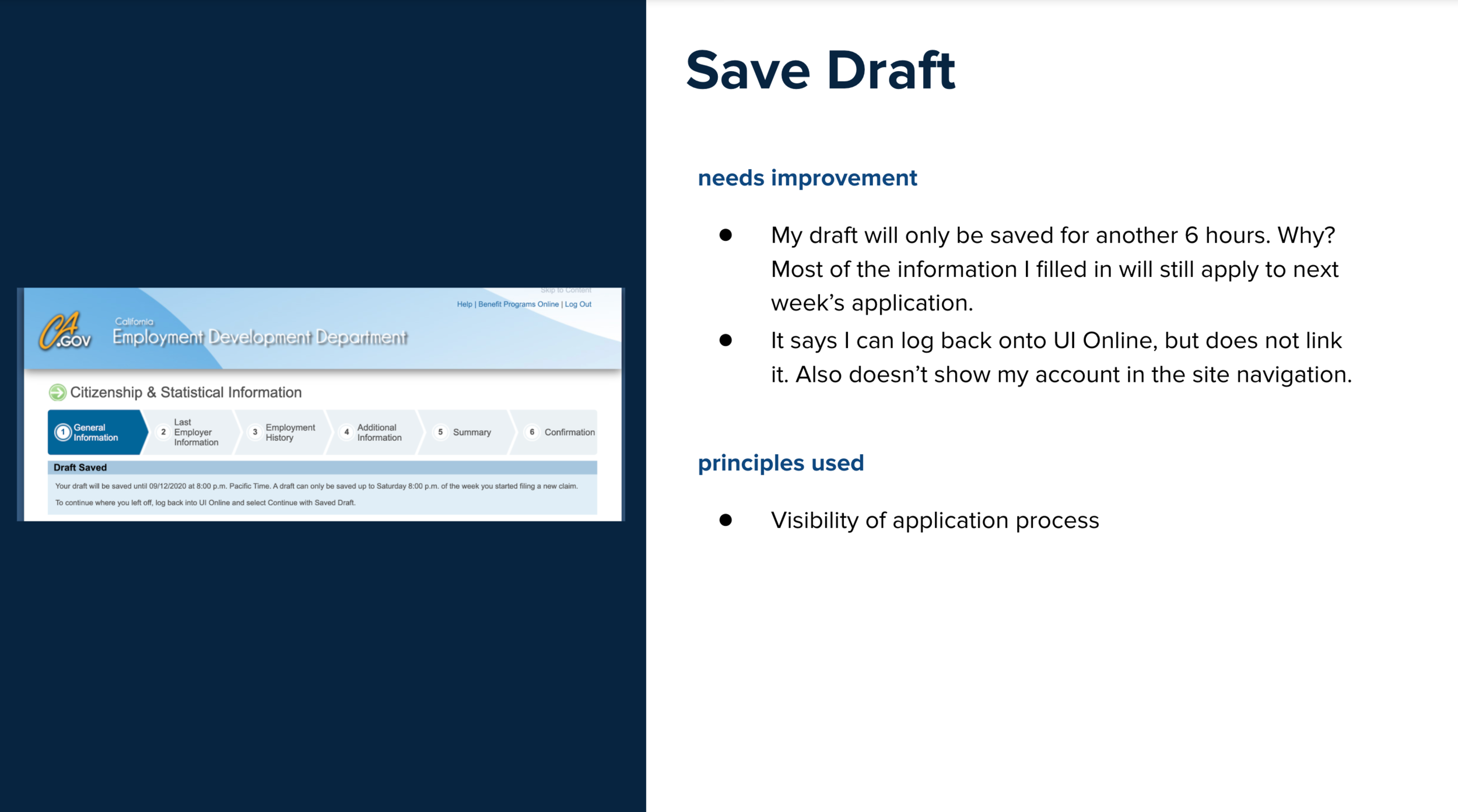
(Above) A few screens from my audit deck.
Recommendations
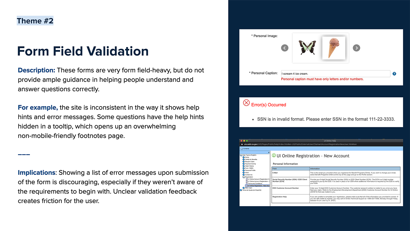
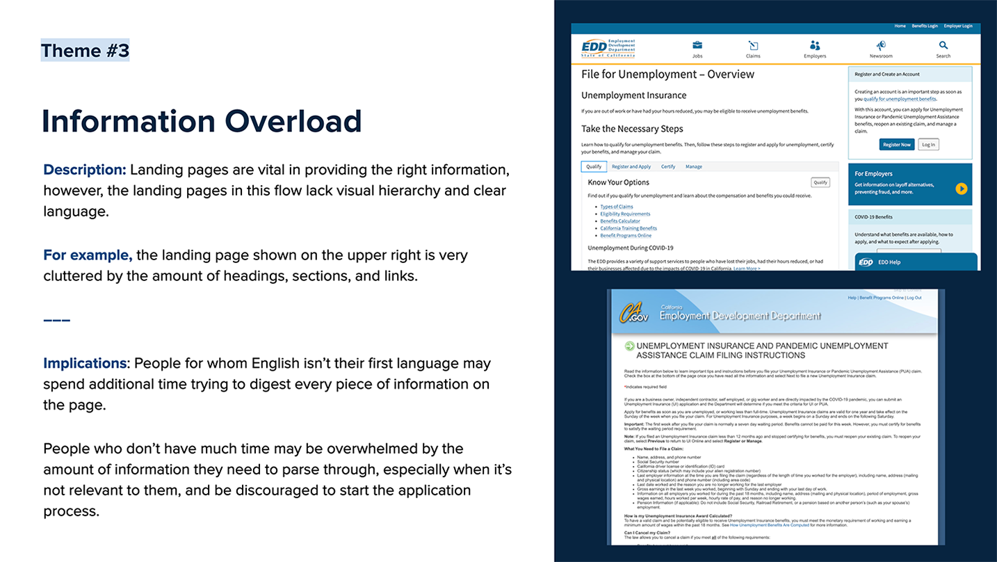
(Where do I even begin?) I definitely expected more from a state department-issued claims form that hundreds of thousands of Californians are relying on for unemployment assistance during this COVID-fueled recession. Basic functionality was lacking, and this outdated online process was actually worse than its paper counterpart. Principles of control and freedom are vital to people who have to fill out forms, especially those who’ve lost control of their current employment situations and are struggling to make ends meet. Errors are immensely frustrating and add unnecessary complexity to a poorly-designed site that is already complex due to its lack of visual and informational hierarchy.
I summarized the most common themes in areas of improvement:

Redesigning the Mobile Experience
Like I mentioned in the intro, this next part of the project was self-initiated, mainly out of frustration from having to actually go through the online form during the audit. I am utterly shocked that a mobile version of this process does not exist in this day and age, so I decided to design one.
Currently, the account registration and screening process page is mobile-friendly. However, once a user logs in to their account, they are presented with a “UI Online Mobile” site option, which opens a confusing page that tells you that you don’t actually have access. The only option you’re left with is to “Continue To Full Site” and fill out the entire application on an unresponsive site. (See screenshots below.)

Dashboard (Existing)
Copy is confusing. (What is an UI Online account?). I have to read lots of unnecessary text before I decide where to click.

Intro Message (Existing)
Wait. So there isn’t actually a mobile web experience for new users?

Another Dashboard (Existing)
Great, an unresponsive site to zoom in and out of on my small phone screen.

Start Application (Existing)
They can’t actually expect me to do this on my phone. I give up.
I decided to start at this page for my redesign and carry out the mobile web experience where it currently leaves off. This flow will take new applicants through filing a new claim, in a simplified manner that indicates progress and uses proper form fields to provide help and validate entered information. I focused on cleaning up the flow and the copy while sticking to a straight-forward and practical visual style and design system that uses common UX patterns to guide people through the process.

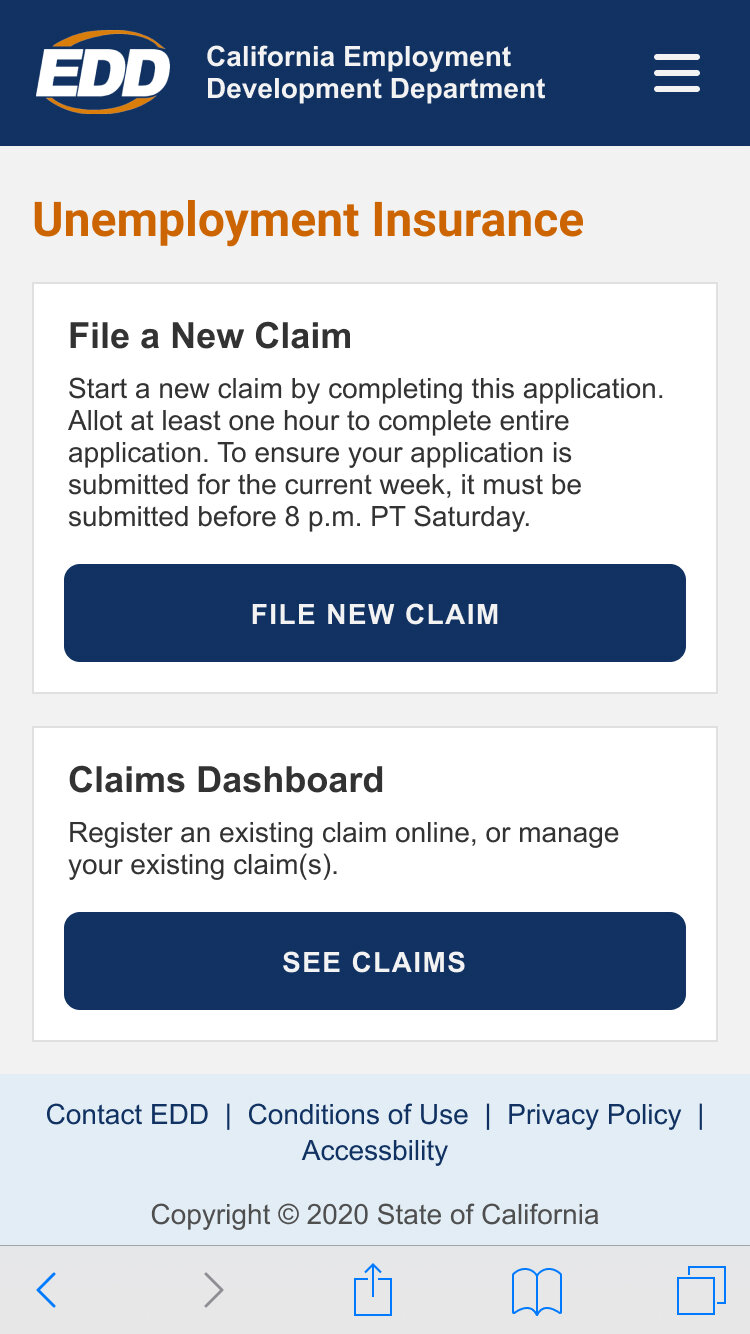
All Benefits Dashboard
This page is a reimagined version of “Benefits Programs Online” with clearer headlines and CTA buttons to reduce friction. The copy is more more concise and I’m able to fit all three options above the fold. Ideally the CTA copy would change depending on the status of your claim applications. (“File a Claim” vs “Complete Your Claim”) Finally I added a menu navigation to consolidate all account-related links (which I had trouble locating in the existing site.)
UI Dashboard
Once the user chooses to access their Unemployment Insurance claims, they have the option of filing a new claim or managing existing claims. I chose to condense the copy to more clearly explain the complicated claim submission window requirement.

Initial Screening
Claimants have to complete a screening before starting the actual application. I used the existing number of questions to set a precedent of no more than 6 questions a page.

Application Dashboard
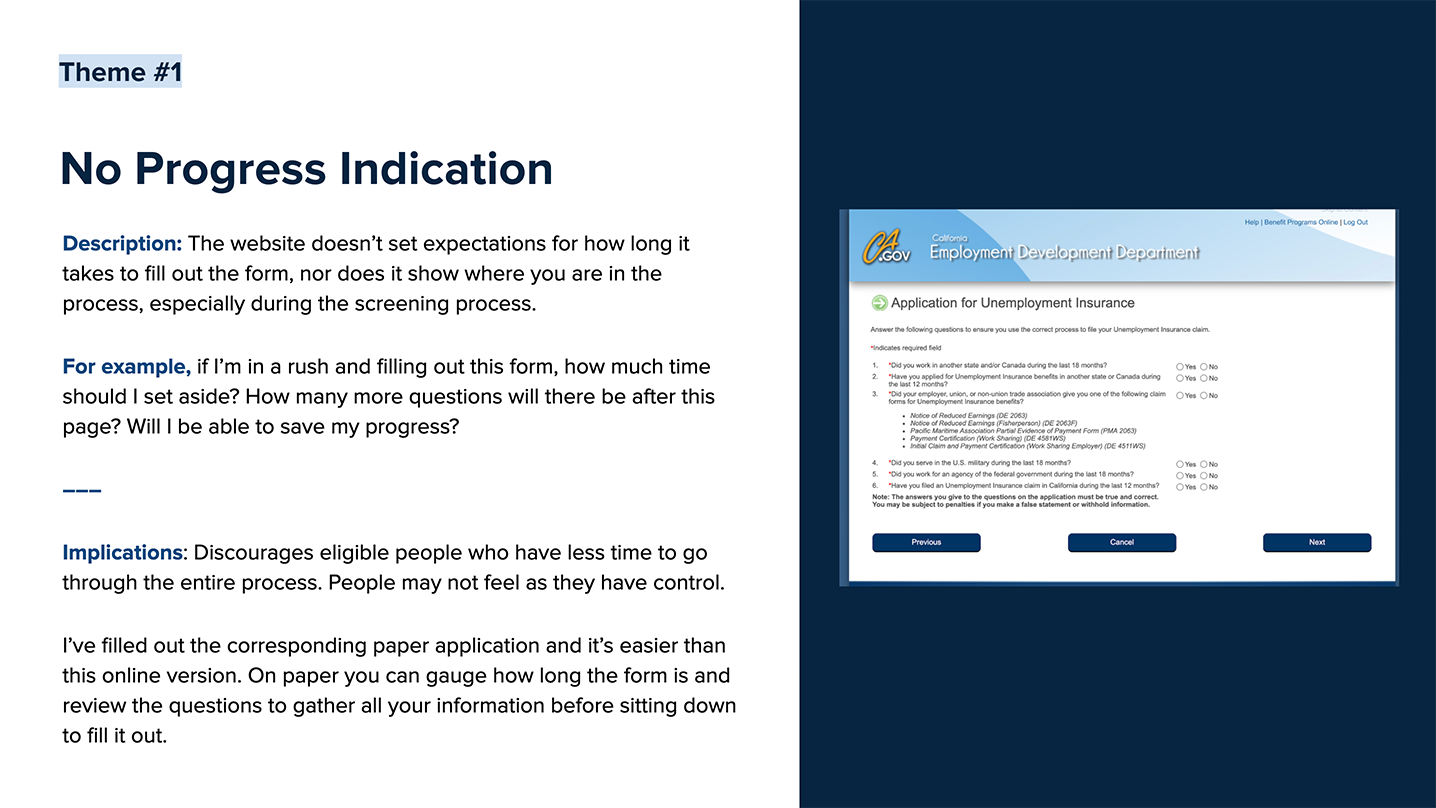
This page doesn’t existing in the currently flow, but based on the recommendation of progress indication, I created a page that allows users to get a top-level overview of the entire application prior to starting. The application is divided into 4 sections, and the amount of time left sets expectations for how long the process will take. This also gives people the freedom to start filling out whichever section they can, without having to follow one set linear path.

General Information: Identification
Once the user starts the application, the sticky header at the top of the page changes to show the form title, form progress, and an exit button. This change hides the blue EDD header, clearly indicates that the user is now within the application wizard, and allows them to see how many steps are left.
The original version of this form has a long paragraph of instructions clarifying the SSN and ECN. I chose to move that information down to live in the subcopy under the relevant question.
These questions also establish the pattern of using asterisks to indicate required fields, and placeholder text that hints at numeral formatting.

General Information: Identification (cont’d)
This screen shows the styling of a tooltip. A major oversight of the existing application is how much important description used for clarification is hidden in help indicators that open up outdated help pages. Relevant description should always be shown in-page to ensure visibility. The usage of help indicators should be minimal and only used when the description is less pertinent or lengthy.

General Information: Citizenship
Because the following screen is determined by the answer to this question, I chose to keep the following questions on a separate page. Here you can see the Save and Back buttons that allow the user to progress through the steps, saving their progress with every page.

General Information: Citizenship (cont’d)
These questions only show if the user answered “No” to the previous question. Also an example of a dropdown text field.

Last Employer Information: Details
This screen shows an active outline text field. Because the labels live inside each of the fields to save space on the page, tooltips are located to the right of each field.

Last Employer Information: Details (cont’d)
This screen shows a text field error message. The message is highlighted in red, and called out at the top of the page and underneath each individual field.

Quit Application
Because the user saves every page as they progress through the application, they can exit at any time without worrying about losing their draft.

Application Dashboard (In-Progress)
A dismissible message at the top of the page confirms that the draft is saved.
With the completion of each section, users are redirected back to this Application Dashboard page, where they can pause to view their progress and pick up where they left off with their draft at their desired pace.
Reflection
This project was a great design exercise in wizard flows and form field interactions. It isn’t the most flashy of design projects, but definitely practical and universal in its usage. I always want to be doing design projects that are rooted in real problems. And most of the time, real problems aren’t sexy.
Sadly, the reality of this situation is that the state agency still uses extremely outdated systems that haven’t caught up with technology. When quarantine started, the government had to suddenly adapt to the challenge of shifting to remote processes as well as handle the influx of incoming benefits enrollment. This source claims that the Employment Development Department is facing a “massive backlog of [1.6 million] unresolved claims, delayed payments, undetected fraud and a near-impossible-to-get-through phone system.” Fortunately, Gov. Gavin Newsom recently announced he’s commissioned a strike team to lead process and technology reforms at the EDD, lead by Jennifer Pahlka, former U.S. Deputy Chief Technology Officer and founder of Code for America. (Woot woot!)
This was my first National Day, and it was inspiring to hear from panelists who are passionate about people over bureaucracy and taking an active effort to meet people’s real needs. Even though there are systemic barriers at play, what can technology do to close the gap between folks who are eligible for benefits and actually receiving them? How do we serve all safety net clients with empathy and dignity? The only way we can make our country better is by coming together and believing in what’s possible.
Last but not least, go vote! It’s our civic duty. California peeps, expect to get your ballot by Oct. 5, and use this site to check on the status of your ballot.