UI/UX Design: LinkedIn for Creatives

A redesign concept of the LinkedIn profile for creative professionals to highlight projects and skills.
"Linkedin for Creatives" is a personal side project made for fun, to practice my research and design skills. Although my personal experience with Linkedin has been great, here are some suggestions I believe would improve the functions and features of the site.
Overview
LinkedIn is the leading site for professional networking, allowing members to creative profiles and connect to one another. Although it does a great job allowing users to easily create an online CV describing their work experience, education, and skills, the site's user interface and experience design are not the most suitable in representing the work experience and skills of creative professionals.
Introduction
Hey, I'm Sophia!
I spent the last year of my life job searching after graduating from school. I'm familiar with the struggle of applying for hundreds of jobs, attempting to network professionally, and putting my skills and portfolio on the internet in hopes someone will see and appreciate my talents and skills enough to offer me a job.
I'm a creative who loves to design, work in design, and network with employers looking to hire designers. I love building my portfolio here on my personal website, but my work is rarely seen unless people click into my website URL. When it comes to professional networking, LinkedIn is the place to be. Employers browse the profiles of job seekers who post their CVs. The LinkedIn profile is a great place to learn about someone's work history, skills, and mutual connections. However, for creatives, Linkedin is a difficult platform on which to show our work and portfolio pieces without getting caught up in others' profiles, highlights, and activity statuses.
The Problem
Creatives don't have a suitable place to share their project-based work on Linkedin. Recruiters can't easily view a job applicant's work on their current Linkedin profiles.
Research
I interviewed some creative friends and hiring managers who use LinkedIn and asked to hear their pain points while using the site. Here are two user personas and journey maps that represent two types of people who use Linkedin.

The interviewees also responded to the usability, interactivity, features, and usefulness of the site. I organized their responses into three categories: job search, home feed, and profile page.
Job Search
"I can't search for job postings with a keywords. And since the results are divided into pages, I can't Ctrl+F to find what I need either."
"Yes I use LinkedIn for job searching... their search results can probably be better in terms of filters. Sometimes I still get 5+ yrs of experience needed when under entry level filters. I mainly use it for job hunting purposes so I think the Search can be improved. Like when they group ‘jobs that may interest you’ it runs from a large range of experience but I can’t tell until I click and view the actual posting. It's time consuming and inconvenient."
"Company profiles who are actively hiring should be flagged for easy filtering, so we don't have to write in our individual profile headline that "We're Hiring."
Home Feed
"My feed is too long and sometimes unorganized showing older posts at the top when I want to read newer posts which are at the bottom."
Profile Page
"I would like a share button on the profile page. It has one but in is underneath the “…” icon. It is not as clear. Because I need to share my Linkedin profile page to my job application."
"I think the dashboard is glaringly obtrusive to the profile view. It breaks the flow of my scanning when I’m going through my profile. I would’ve liked it to be on top of the page or maybe the side so that the profile stays mostly put together."
"The endorsements are confusing. I don't understand why only my most endorsed skills show up and why the skills are categorized."
"The bio/description: Putting a portfolio or other links to works doesn’t show unless someone clicks ‘see more’ so it’s basically hidden. They should have a more accessible place to show that especially to recruiters who specifically ask for works examples."
"I hate the way they do links to external sites/images. They use this box/card style when you want to link to something but clicking it opens this display-view that is so poorly designed."
"What also bothers me is that a lot of designers put that in their “about me” section to link to their portfolio, but when you click it, all it does is open a viewer of the thumbnail that’s being used, and then you need to click “View from source” or something like that in order to get to the actual portfolio."
"Personally don’t like the restriction in headings based on their preselected topics (Organization, Role..) on the volunteer experience because sometimes it doesn’t make sense for some positions. It’d be nice to have more customizability."
"I wish the profile page would have a feature to display our website or portfolio, especially for designers, similar to Dribbble."
Goal
Hearing this feedback reaffirmed my own observations about the struggles of using LinkedIn for creative individuals. People working in creative industries such as freelancers and students often times get hired for their skills as shown through their portfolio pieces and personal work rather than work experience. I decided I would focus on the most prominent pain point by redesigning a Linkedin personal profile page that clearly presents a creative professional's work and skill set.
I mocked up the existing profile page and added notes to sections that could be improved upon in my redesign, noting problems and potential solutions.

Mockup
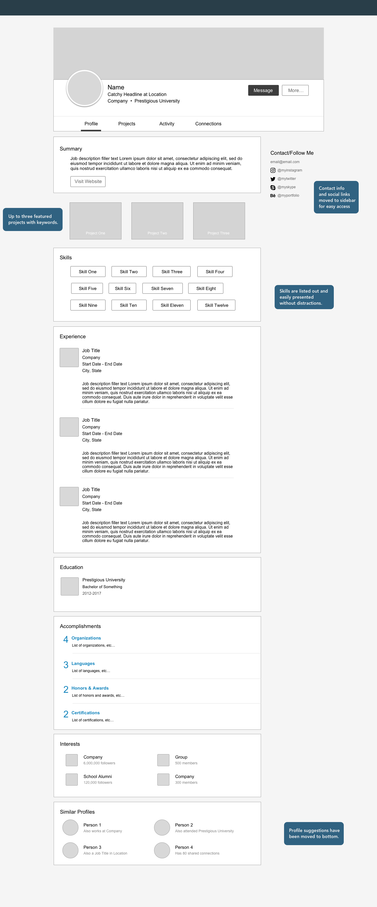
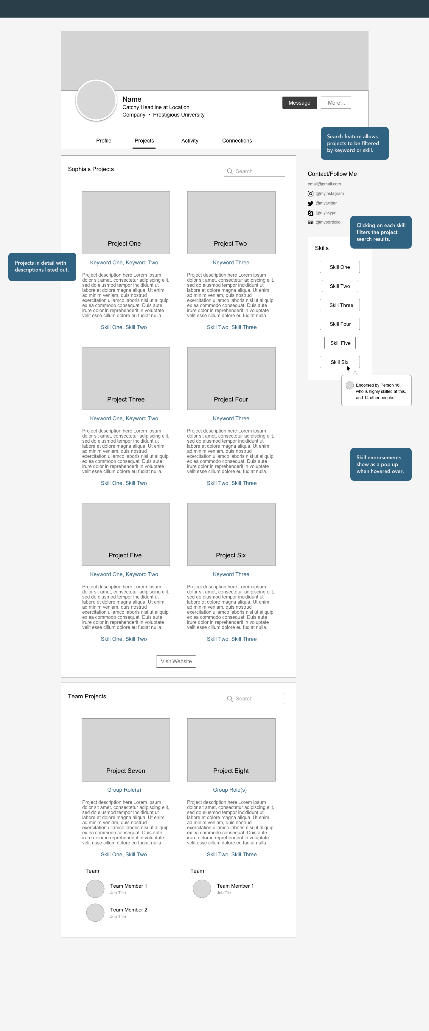
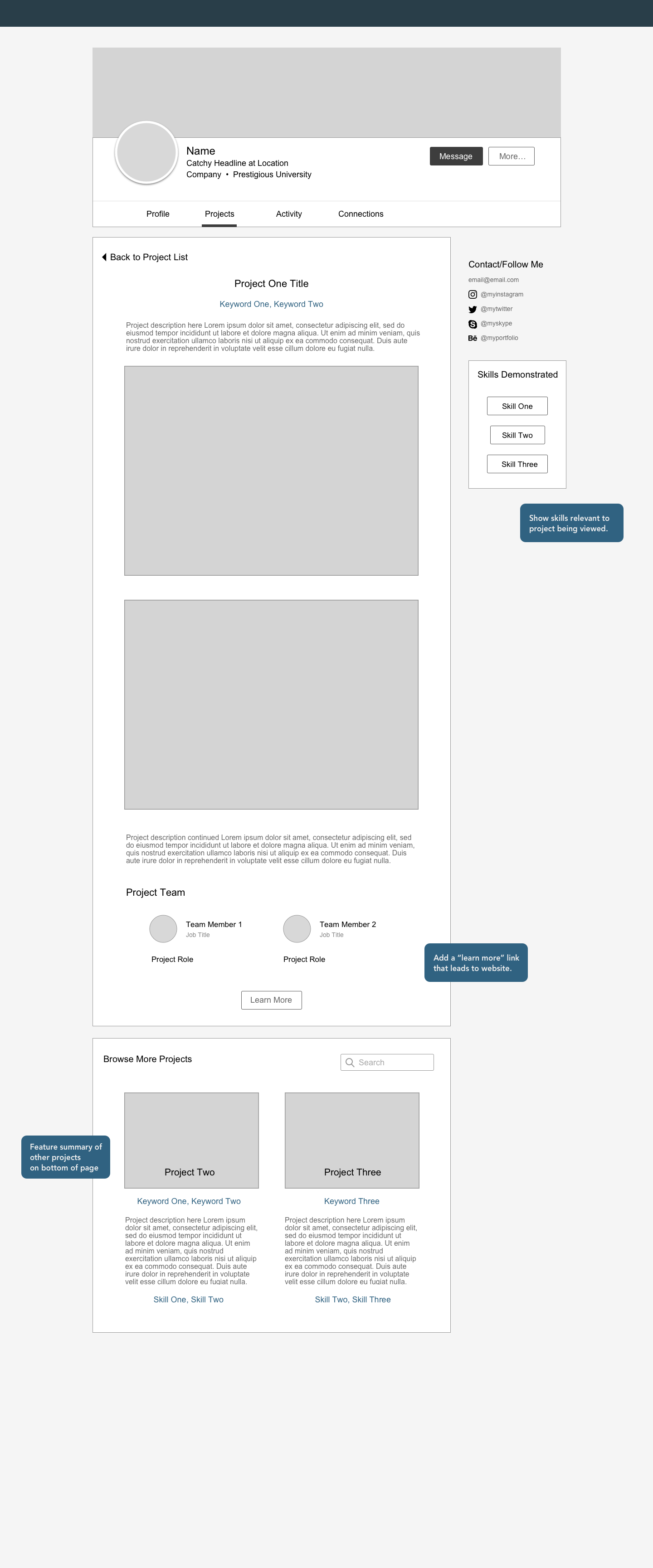
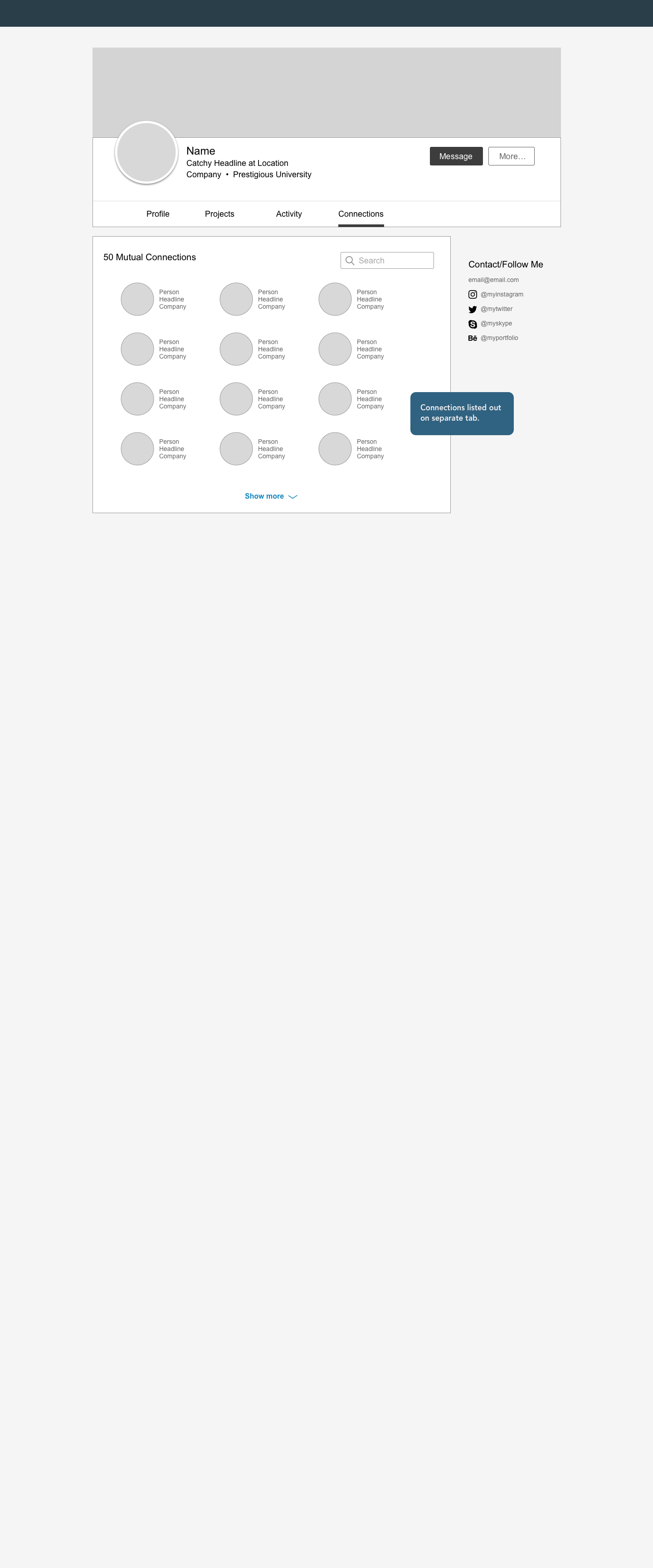
I created low fidelity wireframes to visualize rearranged and new content. I divided up the profile page into separate streamlined pages that are accessed through tabs. From here I continued testing and gathering feedback.
Click through slideshow below to see all four redesigned pages: Profile, Projects, Project Detail, Connections.
Usability Testing
I got some feedback from interviewees who looked through my wireframe designs.
"This is a great idea. The layout looks nice and I appreciate that you added a portfolio section for creative professionals with work to show. However, not all portfolios have images. Have you looked at how to incorporate a non-image based portfolio into your Linkedin profile?"
"Yes, I think this new Projects page would be really helpful. I won't have to click into an applicant's personal site to quickly browse their projects."
"I'm not too sure about the skills section. I like the current Linkedin section that only highlights your top 3 skills to narrow down the most important skills. Recruiters don't have time to look at all of your skills. If you're an expert in your role, you don't need to list out the tools you use. If you're an entry-level professional, maybe it's good to show more skills. Redesigning Linkedin is tricky because it's catered to such a broad audience with varying levels of experience and very different work."
The final design
Although it's difficult to create a template suitable for every professional on Linkedin, this template can easily be implemented into the site if users are given the option to create an experienced-based or project-based profile. This way the most important components of a user's professional profile in their respective fields can be highlighted, allowing LinkedIn to better communicate skills and talents from job seekers to employers.
The Profile Page

The Projects Summary Page

The Project Detail Page

Next Steps
Design a similar project-based profile page for the mobile version of the site.
Learn about what professionals in other fields look to focus on when creating a Linkedin profile.
Gather more feedback from recruiters and what they look for when browsing applicant profiles.
Redesign the job search page and home feed.
Work with LinkedIn's UI/UX designers to conduct usability testing and further refine the existing site's user experience and interface design.
Reflection
Through this week-long personal project I got to practice the iterative process of user experience design through research and usability testing. Talking to others provided new insights on different perspectives and customer journeys. I'd love to continue working on this project in real-life practice if given the chance.
Let me know what you think of this redesign. I'd love to hear your feedback!
Edit: As of April 5th, I found out Linkedin is actually rolling out some new design changes to its profile page. My page hasn't changed yet but I'm excited to see what it ends up looking like!
I hope you enjoyed this case study. If you ever want to work together, leave me a note.