
Home Design Diaries
I started writing this post the winter we first moved into our Westlake house, but never finished because I never thought the house was “complete.” There was always more to paint, more to hang, more to upgrade and beautify. However, now that we’re nesting and waiting for baby’s arrival, there is a real deadline to work up against. I had an “oh crap” moment recently when my dad mentioned we may have to get rid of the piano to make space for kids’ desks someday. Although that’s still quite a ways away, the idea that our house will longer be “ours” shocked both Simon and me. Goodbye, beautiful neat adult living room. Farewell matching sets of bowls and plates, so long spotless Italian leather sofa, adios neat color-coordinated decor…
But until then, I’m determined to fix up our kid-less home one last time for the foreseeable future and finally publish this blog post that documents our almost 4-year-long home interior design process. The story starts in 2021…


Above: Photos of the house interior the day we got our keys in September of 2021. Unflattering blue paint that made the place feel cold, tacky boob lights, and that cheugy patterned wallpaper in the living room... ack! But the foundations were good.
Getting Inspired
When our house offer got accepted, I jumped straight into interior design. I watched a Masterclass, binged a million Architecture Digest celebrity home tours, and spent my weekends perusing showrooms at West Elm and Ikea. Although I’ve always loved decorating, I’d never splurged on doing so while renting because I was always moving. But the time had finally come. I was excited that my home design dreams were actually coming to fruition.
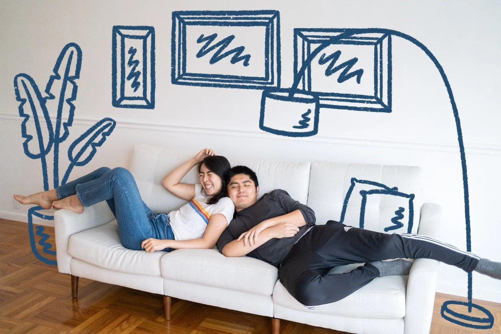
However, once I got into the weeds of interior design inspiration found in polished magazine photos and Pinterest, I realized I wasn’t here to stage a house. I wanted to design our home, where a living room was meant for living, bookshelves were for books, and couches were for butts. Aesthetics were nice, but first and foremost form needed to follow functionality in our limited square footage. Each room needed to programmatically serve multiple practical functions. I held tightly to that principle as I sketched out rough floor plans to determine which furniture pieces would fit and sit in each of these rooms.

The living room is meant to be an entryway for people to put things down, a gathering space for non-food activities, TV-watching with friends or alone, a music room, and a home gym. This is our biggest space, and I wanted to divide it up in an organic way so it always felt cozy.

The bedroom is pretty self-explanatory, but it needed to accommodate my always-expanding wardrobe. And Simon’s too, I guess. Feng shui-wise, this was probably the only spot we could fit our queen bed.

The dining room is obviously for anything eating and drinking-related, but also for food storage, a bar, playing board games, small group conversations, or sometimes an extra desk or study space. This is our smallest room, so the size of dining table was critical to maximize guest seating.

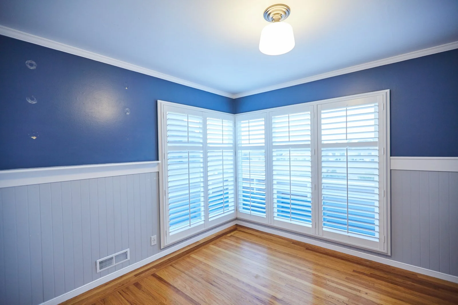
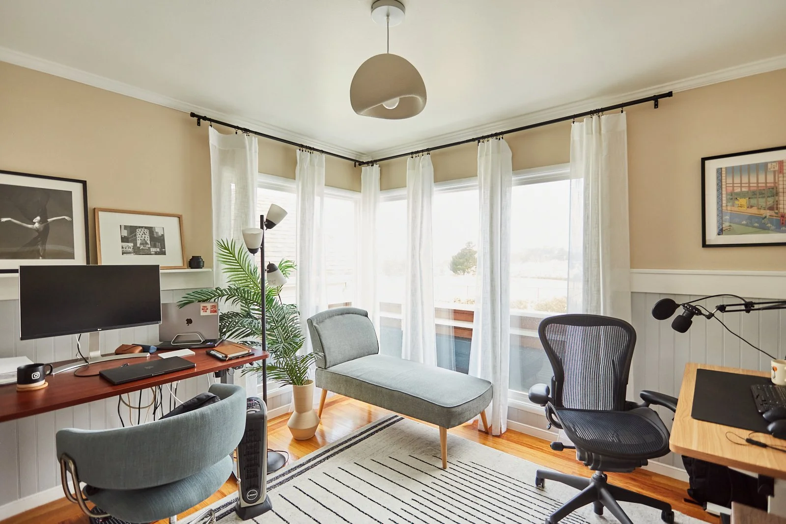
Since we work from home often, the second bedroom had to serve as our office, which needed to accommodate both our desks in a position where we couldn’t be distracting in background of the other person’s video conference calls. A secondary goal was to have the space also convert into a guest bedroom if needed.

An alternate option for our office layout, in case Simon didn’t want to work from the closet. (Spoiler: he did not.)
After initial floor sketches, we modeled the house in SketchUp to measure rough furniture sizes and test out paint colors. Having a 3D mock of our house helped me envision the us living in the house and moving through the space even though we hadn’t officially gotten the keys yet. I spent our escrow period making sure I had a clear vision for interiors so move-in wouldn’t be stalled by lingering design decisions.

Despite years of architecture school, this was the first time I got to use SketchUp for a practical purpose.
The Piano Situation
Simon wanted a piano, but I knew that wouldn’t be a reality until we actually found and bought one. So I drew up proposed floor plans with and without piano. Pianos also come in different sizes, so depending on what we found, the rest of our living room space would have to accommodate.

Proposed floor plan for a baby grand piano.

Proposed floor plan for an upright piano.

In the days leading up to the delivery of the piano, we taped an outline on the floor in anticipation. Simon giggles with delight as he pretends to play.
Ultimately, we ended up buying a baby grand piano from a local high school orchestra teacher, which meant moving our couch off-center from the fireplace. This actually worked out in our favor as we realized mounting a TV above a tall fireplace was not ideal.
Furniture Shopping
Next came the shopping. Browsing was fun but somewhere amongst the furniture catalogs and an infinite scroll of internet reviews, decision paralysis crept in. Consumerism made me feel like I needed to spend tons of money accumulating things to build a home I love. I didn’t like that.
Committing to purchases was also stressful. Was this piece going to last a long time? Is it worth investing in something nice at this moment? What is our standard for quality? More importantly, will this style of furniture work with future trends I might adopt?
For a few months after we moved in with basic pieces of furniture we’d already owned, I spent every free waking moment on Facebook Marketplace, Nextdoor, and Craiglist, scrolling… vetting… bargaining. On the weekends, we drove to every neighborhood furniture store and scoped out the inventory, from higher end to budget price ranges. We had a good laugh as we walked into Restoration Hardware and glanced at price tags. And then got truly excited when we discovered a local used furniture store that liquidated desks and chairs from offices that had closed down mid-pandemic. At the end of it all, I had found some quality pieces from brands we liked for a fraction of the price (sound familiar?), even if it meant messaging Facebook sellers at odd hours and rushing over to complete the transaction before they flaked. (Which unfortunately happened more often than not.)
Some of my best secondhand finds: our Article walnut dining table, Scandinavian Designs dining chairs, a Crate & Barrel bluestone coffee table (gifted by a coworker), a modular Burrow sofa, the Herman Miller Aeron desk chair, the popular IKEA bamboo pendant lamp, and chairs and side tables from various brands. For some other things we ultimately did purchase new, like our Thuma bedframe, Living Spaces dresser, Wayfair rugs, and Ana Furniture sofa. Investing in a good leather sofa felt like a life-long commitment, but it’s a good one.


Choosing Art
I strongly believe the art displayed in one’s home should be meaningful. And gallery walls are my favorite vehicle for this because they serve as a hodge podge of art, photography, personal pieces that reflect the interests of the homeowners. But somehow, interior design #inspo has made them all about vaguely minimalist posters and meaningless junk.
In my home, I want everything I display to have a story. The art should tell the story of our lives, our loved ones, our creativity and inspiration. When people walk into our home, I want them to be amused by the art and start conversations about subjects we find mutually interesting. So I figured out the vignettes I wanted to set up in each room, and got busy creating my own art.
Plans for our office shelving
Plans for our bedroom gallery wall


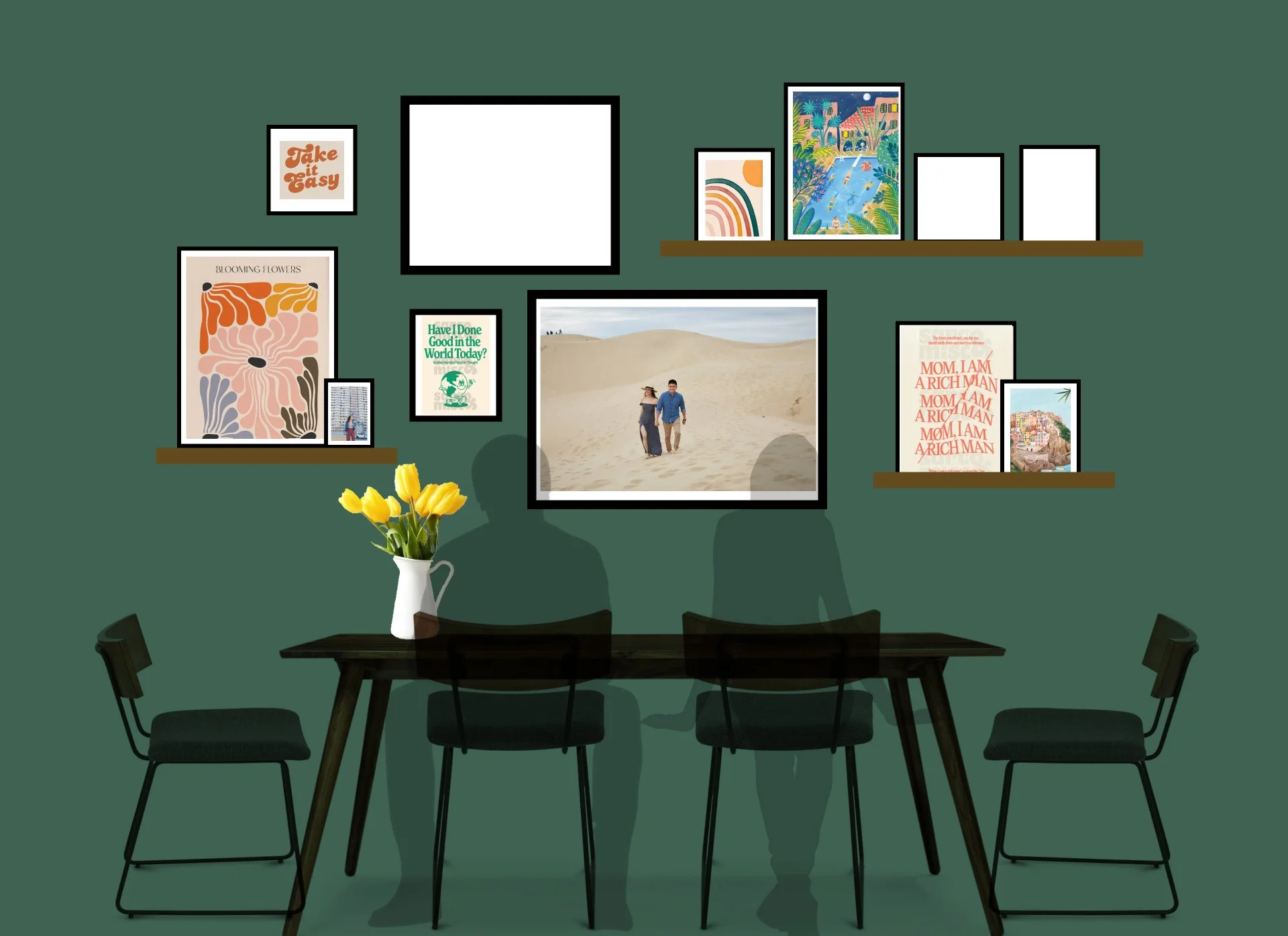
Above: Gallery wall mock-ups for our dining room helped me determine the shelves, frames, and art pieces I needed to gather.
art pieces I created
As you may be able to tell, I love handdrawn pieces that add a touch of whimsy to the artwork around the house. And who best to do them but myself? In my free time, I’m always planning the next project, doodling the next illustration, or shopping for the perfect mounting hardware. I recently learned about the French cleat and it’s blowing my mind!
A risograph version of an outfit I’ve worn for my fashion-oriented bedroom.
Our personalized kitchen alphabet represents all the things we love to eat and cook with. Can you name all the things?
The dining room gallery wall hosts a smattering of old drawings, fine art photographs, and meaningful memorabilia, like vintage Bart classes dating back to the 1980s that belonged to Simon’s parents.
I really wanted Keith Haring wallpaper so I painted it myself. This one column took two whole days, so the rest of the closet is yet to be completed. Someday…

Above our living room sofa sits three illustrations representing my childhood home, Simon’s childhood home, and the home we moved into together.
At the entrance to the office hangs a large piece of artwork showcasing our home buying journey. Yes, I painstakingly drew every single house but it’s delightful to look at the journey we took to get here — condos, tiny houses, and all.

The yet-to-be-mounted gallery above my desk showcases moments that symbolize my career: my childhood love for art despite my dad’s resistance, my photography background, and my photo displayed in Times Square the day ThredUP IPO’d.

This freehand wall painting was something I did the week before a bunch of friends stayed over for a weekend. The entrance to the guest bedroom cuts through the unkept garage, so I wanted to ease the transition from nicely decorated house into their room with vibrant colors and more handpainted “wallpaper.”
The Reveal
As I mentioned at the start, the number one goal of everything was practicality. This sensibility influenced how we chose furniture pieces, rugs, drapes, cabinetry, everything. To divide and conquer this huge project, I started with the public spaces. The living room, dining room, and bathroom had to serve the guest experience, providing comfort, entertainment, and whatever people may need. I wanted these rooms to look elevated but not perfect-looking and meticulous, otherwise guests will feel like they can’t touch anything. The worst result would be to have my home resemble a Kardashian museum.
Aesthetics were secondary, but obviously also important to me. Design-wise, because this home is a literal mid-century house, I wanted to include tenets of retro trends, like 1960s pastel color palettes, amorphous shapes from the space-age aesthetic, and minimalist furniture pieces that are still popular today and relatively easy to find. I leaned into warmth and character, expressed through colors and materiality, as opposed to the generic and modern Airbnb look.
The Living Room
Mood: Fun, multi-functional, full of seating, colorful
Part entertainment space, part music room, part home gym, part art gallery. The living room isn’t enormous, but was meant for gathering, so I divided the space into little nooks to enhance coziness. Over the years, the room has shape-shifted to accommodate workouts, sleepovers, sports games watch parties, and holiday decor.
I used a large high-pile rug and colorful bolster pillows to bring seating down to the ground level, and placed fun objects around the room for guests to tinker with and flip through when they visit. There are four different instruments on display, board games, music books, records, and a coffee table full of our photo albums and old yearbooks. Unintentionally, we also ended up dedicating one corner of this room to plants because it’s got the best corner window light.
The fireplace area isn’t complete yet as I’m still working on a large piece of artwork to hang and fill up the height of the room.
Before


The dining room
Mood: Moody, inviting, mid-century modern, a little space-age
The smallest and darkest room in the house allowed me to indulge in a darker, moodier palette reminiscent of one found in a classy British pub. Hunter green had just become my favorite color, and looked incredibly elegant when paired with gold and wooden accents in furniture. The dark color was controversial, but I committed to my vision and ended up creating my favorite room. I topped it all off with a sputnik chandelier that brightens the room up for the countless dinner parties we’ve had over the years.
This room also doubles as pantry overflow, but it’s been tidied up for the sake of these photos. Except the for limes. I love limes.
Before


The Office
Mood: Functional, productive, organized, neutral
This room’s aesthetic was almost entirely made up of furniture we’d already owned, so it wasn’t as “designed” as it could be. We replaced the window shutters with breezy drapes and moved in our standing desks. We also fit a old chaise in the corner for mini naps and putting our feet up. When I’m in the office I’m more likely than not focused on my computer screen, so the room itself ultimately just needed to be organized enough to promote productivity. However, because I’m always on video conference calls for work, I needed a nice background, which I created with a decorative bookshelf, a designer-looking light fixture, and floating shelves that hold Simon’s code books.
Ripping the doors off the closet was one of the best impulse decisions we made as it expanded the size of the room. Imagine my happiness when I found bookshelves (from Nextdoor and IKEA) that fit into the closet perfectly to hold all our odds and ends. The office isn’t meant to be neat, but to be a workspace for my creative energy. My desk space needs to accommodate my ongoing creative projects, which I don’t see a need to hide. A reflection of my inner mind, it’s an organized mess. Although I could use some help with under-the-desk cord management…
Before


The Bedroom
Mood: Cozy, warm, mid-century modern, bohemian, textural
The bedroom was my slowest project, since it was the most private room of the house. But it was also where my clothes lived, so it deserved love. Simon and I bought a nice bed frame and mid-century modern dresser, then I slowly found secondhand pieces to fill up the space. Straw-textured pieces and earthy colors liven the room, especially at night when we have our overhead light dimmed and bedside lamps on. I splurged on linen CB2 blackout curtains that block out light and give the room a warm, soft feel. The rest of the room is decorated with clothing and accessories that make the entire space feel like an extension of closet. See that overflowing coat rack? I like my money where I can see it - hanging in my closet.
The wall behind the bed is a bit plain as I’m still brainstorming ways to decorate it without hanging pieces that could fall on our faces in the middle of the night. Perhaps a mural or a DIY upholstered headboard?
Before


What is interior design?
Hot take: Private residences shouldn’t be designed by professionals.
Unless you’re planning to show it off to the public, your home shouldn’t need to impress the world with the latest furniture trends. There’s an endless stream of HGTV features, Architectural Digest tours, and internet ideas that are actually starting to make our homes boring. People are no longer decorating for themselves. As I browsed the internet for inspiration, I had so many questions.
Why are books just placed for decoration? Shouldn’t you find ones you actually read?
Why do people have grass sticking out of a vase?
Why are there weird objects used to decorate shelves? Large seashells, giant chains…why?
Aren’t those “designer” chairs extremely uncomfortable? Why are people lying to themselves? And why do you hate your guests?
A bowl of fruit is not for decoration. It’s a food that you can literally eat. And it rots quickly.
Open shelves in the kitchen won’t keep your dishes clean.
Whether it’s for shock factor or merely to sell more products, design media loves to highlight less practical interiors. But I say do whatever the heck you want — your home should represent your life. Don’t spend your creative energy making your home look like a West Elm catalog. A home should be your family’s sanctuary, your personal museum. It should be built with love, and evolve as you grow. Taking a DIY approach to home decorating gives us so much pride and joy as we spend our everyday surrounded by spaces we love.


Lessons Learned
Don’t rip off dry wall. But if you do, spackle and a sander are your friends.
Buy small cans of varying shades and test your paint colors in reality before you commit. Paint also tends to end up darker than expected.
Painting a room yourself takes much longer than you think, since you have to wait for coats to dry. We thought we could do the house in one weekend, but ended up spending a whole month on it.
This may be a controversial opinion but a shoddy paint job could slightly resemble a sexy limewash paint. I think it’s what makes my green dining room look a little more expensive, ha.
A good lighting fixture completes a room like a good pair of shoes completes an outfit. It creates a sculptural moment in the room and draws the eye upward to emphasize the height of a space.
Curtains and drapes soften windows. Plants soften corners. Rugs soften floors. If you don’t want your room to feel echo-y and cold, rely on these additions to make it feel inviting and lived-in.
You don’t need to spend a lot of money to decorate a house. Good design goes farther than money ever could.
The most budget-friendly way to elevate a room is to buy a large frame (many affordable options from IKEA) and hang artwork or posters. Suddenly you live in an art gallery!
Get high-pile rugs for cozier rooms where you’d want to sit on the ground (living room, bedroom, etc). And low-pile rugs for easier vacuuming and rolling chairs (dining room, office, etc).
Trims and ceilings don’t have to be white! (I’m still learning this one.)
There’s no harm in slow decorating. Intentionally curate items that hold meaning, even if that takes time to collect. Even though I’m writing about this project like the home is done, it’s not. As we get older I expect this space to mature with us.
Check out the video diary here.


And as for the yard? It’s coming along… til next time!


AI this, AI that. Where does the human come in? My thoughts on the future of the design industry coming out of the 2026 Figma Config conference.