
My DIY Wedding: I built a website from scratch
We got married!
We got married this weekend! While I recover from an eventful weekend full of pizza, soju, and dancing, I wanted to share one of my favorites parts of the entire wedding planning process: building the wedding website. Leave it to me to use something as stressful as wedding planning to force myself to learn a tool that’s been in my learning bucket list forever: Webflow. This was the perfect opportunity for me to get accustomed to HTML and CSS, and for the first time, build an entirely custom site to satisfy every ounce of my design snob soul. Even though I work as a designer in tech, I’ve never actually built anything functional from scratch myself, outside of extremely basic coding projects.
But I’m a fast learner.
The Design Brief
No joke — the Monday after I got engaged last April I started writing the project brief for this wedding website. I wanted to redefine a part of the wedding invitation process that feels boring, mundane, and increasingly costly, and turn it into an art project where I can exercise my skills in creative direction, copywriting, graphic design, branding, UI design, interaction design, illustration, filmmaking, and marketing. A DIYer by nature, I didn’t mind taking extra time to learn and build something original for the pure purpose of delight.
I wanted a website that was a lot more fun than the boring, cheesy wedding sites made from preset templates with outdated typography that feel like one long FAQ help center page. If I was going to invite people to my wedding, I’m not going to deliver some invitation pulled together last minute on Shutterfly, or create one of those cookie cutter templates websites on Zola. I want to infuse “us” into every little detail. My guests deserve to be entertained.
Storytelling
This website, along with the accompanying emails sent to guests, were my opportunities to tell our story. There is so much to say about how much meeting Simon has changed my life and how much we’ve grown together, from college until now. Every line of copy needed to showcase personality and personal brand (i.e. a lot of sass). I wanted guests who didn’t know us as well to learn about who we are as individuals and as a couple.
Gamification
Gamification was another big theme for me, as I wanted to build moments that encouraged our guests to discover and play, making them feel like they can engage in our wedding and, symbolically, our lives. And that they’ll be attending a celebration that isn’t just another run-of-the-mill wedding held just to do so, but a thoughtful event that makes their attendance and support feel worthwhile and appreciated.
Art Direction
UI-wise, I’m loving the latest retro-inspired design trends, but with the responsiveness and accessibility of the modern internet. I layered in textures and illustrations as delightful touches that sat upon animation-inspired backgrounds using screenshots from Miyazaki films. I wanted to use color and hand-drawn illustrations to make our site as different as possible from templatized wedding sites.
Save the Date Announcement
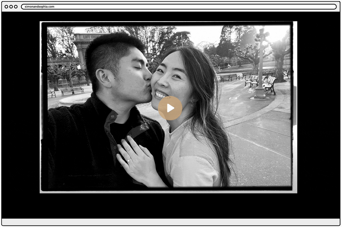
Last fall, after we secured our venue, we sent out digital save the dates. September 28, 2023 marked the ten-year anniversary of the day Simon and I first met, the perfect date to announce our wedding to our dear family and friends. I crafted an email that told our story in words, with a link to open up simonandsophia.com. This is where the storytelling began.
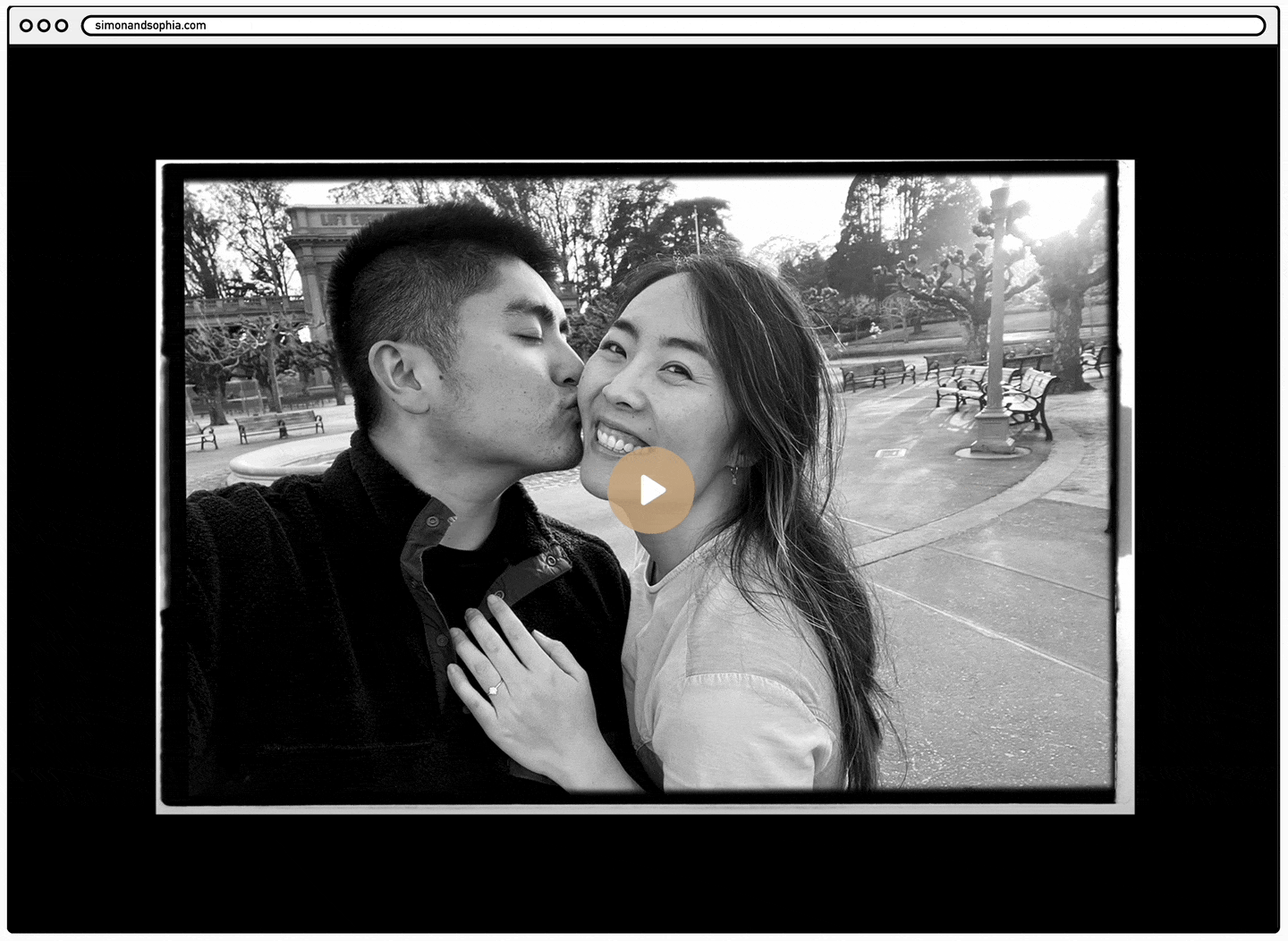
A montage of our love story
This site was a simple single page that started with a video. I wanted the video to resemble a movie trailer that told the story of us, a montage showing glimpses of our relationship that culminated in our engagement. Watch the full video here. Assembling the video itself was its own project as I’ve been pretty into filmmaking lately.
Animating the Lead-up
After the video, you reach the next section that contains animated text formally announcing that we’re getting married! I wanted to continue the montage idea in the video, but in the form of text that highlights some of the more mundane but beautiful small moments in our everyday life together, before launching into the announcement itself. I just had to incorporate (hacky) animation into my first website building project.

The date
The final portion of the single-page site revealed the details of our location, date, and a sneak peak of the venue in illustrated form. And of course, in marketing fashion, you gotta end it all with a call to action. This button opened up the option to add the event to your Google calendar.
The Invitation
Fast forward five months. It was time to build the real wedding website.
I decided I wasn’t going to send physical invitations because they 1. are a waste of paper 2. cost money 3. can get lost in the mail 4. everyone else does it, and 5. I didn’t want to commit to a single design theme or brand. So instead, I would create different invites and allow all my guests to “collect” them like NFTs.

Landing Page
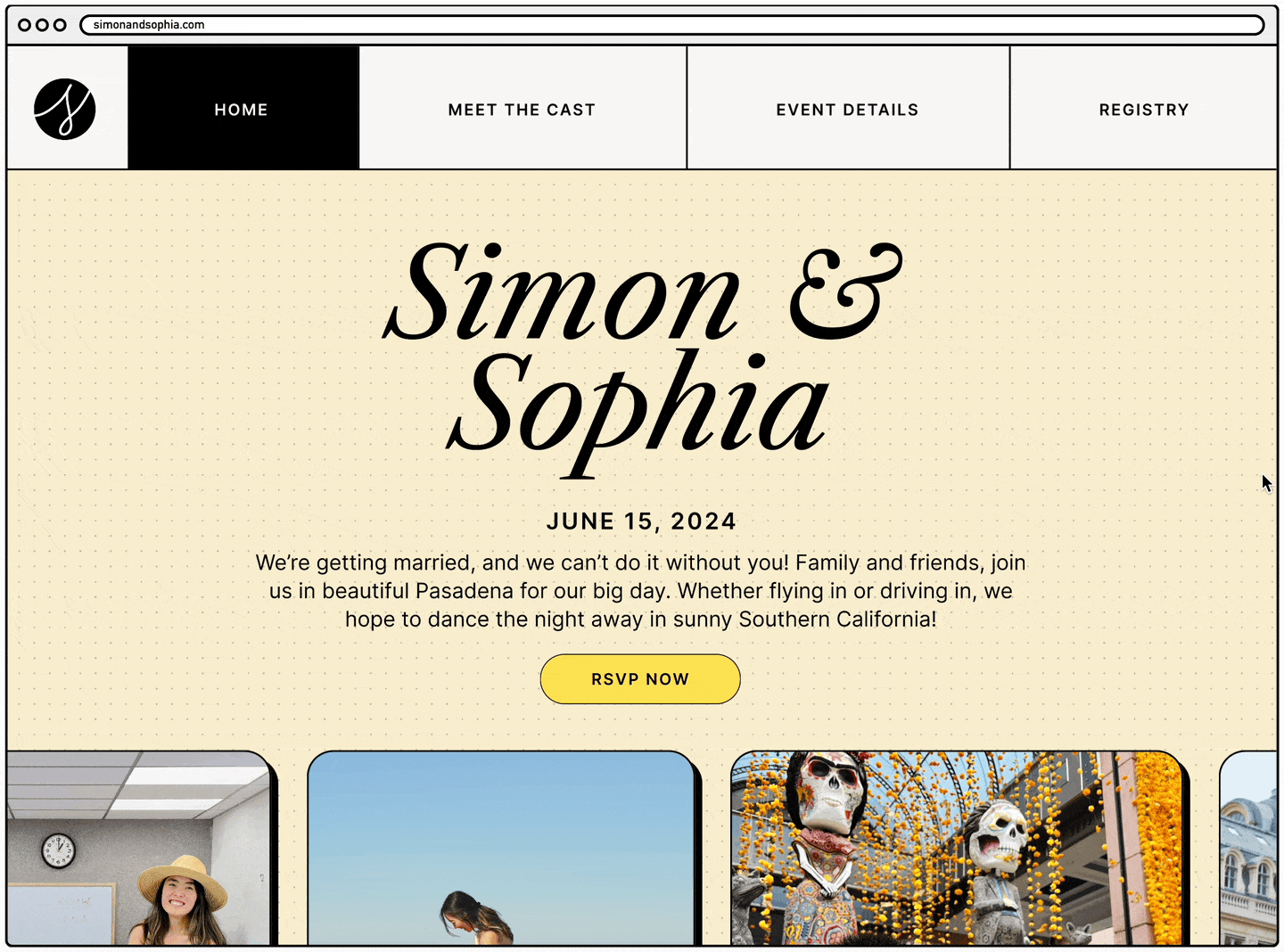
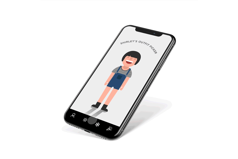
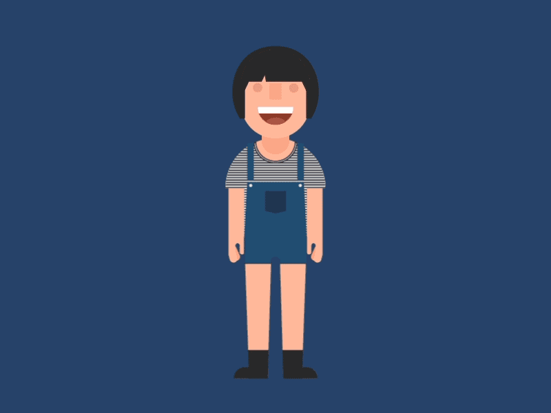
Even though I wasn’t sending them through snail mail, I wanted to recreate the experience through something interactive and whimsical. I took the concept of a package delivery, and landed on the idea of using a Kiki’s Delivery Service theme to help tell that story. It’s subtle, but if you know, you know. When guests clicked into our link through the email, they land on a password page. Once they enter the password, they meet their first game.

Pop a balloon
They’re asked to pop a balloon. Each balloon opens up a variation of the wedding invite.


Infinite loop of invites
For those curious enough to explore, every balloon in the infinite illusion contains a different invite you can collect. I’ve always felt uninspired by the look of “classic” wedding invites. Why always cursive? Why so many watercolor flower accents? I took this opportunity to whip out my rusty graphic design skills, and spent a long weekend painstakingly designing every variation for this balloon game, trying to brainstorm every concept that made sense in the context of our interests, hobbies, and identities. How many did you find?
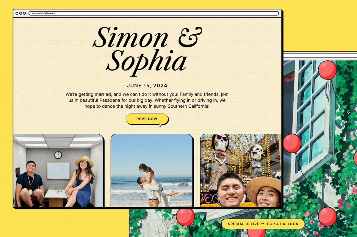
The Website Landing Page
Once guests played the first mini game and secured their invite, they’d enter the main landing page, the perfect place to tell our story. We had to make a good first impression. I wanted to keep it simple but fun, so ended up condensing the navigation to the most basic three categories: home (our story), meet the cast (who’s who in our party), and event details (info page).
This is Us
I’m generally uninspired by wedding sites filled with photos from one single engagement shoot, because those photos usually tell me nothing about you or your relationship. Instead, I wanted to include a collection of images from our 9 years together and recap our love story through a rotating carousel of images. Because the places we’ve traveled to and made memories at are much more meaningful than a beach some photographer took you to.

Our Story
Following the photo carousel was our love story in words. And a belated (staged) engagement photo.

Trivia Time
After a lengthy read, I added a fun little trivia game to keep people entertained. Remember how I said I wanted to make the site interactive? You got to quiz people on their reading, and obviously throw in some trick questions.

CTA Footer
To keep people on the task at hand, the footer component at the bottom of every page reminded guests to not forget the main action we want them to take at the end of it all. You can take the girl out of marketing, but never the marketing out of the girl.
Meet the Wedding Party
The second tab was here to introduce VIPs, the family members and friends that make us who we are. (We owe everything to them!) And as for the stage terminology? 1. We love musical theater. 2. I feel like throwing a wedding nowadays is a little like putting on a show. You put on makeup and a costume and perform your vows, wave to the audience, get your picture taken, put your relationship on show, etc. I’m always one to poke fun at a trope.

Hello, it’s us
The leads: The original idea was to have Simon and myself write each other’s bios, because 1. it’s conceited to write about yourself and 2. writing about each other showcases how we view (and love) each other. I asked ChatGPT to help me write Simon’s bio, and it was so over-the-top I kept it all and cited her. Then Simon did the same. Perfection. (Hey Siri, add “prompt engineer” to my resume.)

Meet the company
The supporting cast: I wanted to make this part fun and comical. I chose photos on complete opposite end of the spectrum from the overly posed, self-conscious portraits you typically see on social media. These animated photos showcase our friends’ goofy personalities and remind us what we love most about them. They’re accompanied by engaging factoids meant to break the ice between those who have not yet met each other.
Accumulating Event Details
This page is a bit more text-heavy but necessary. I wanted to keep all the information in one page because I personally don’t like when websites have too many links in the nav to flip between. All the info about wedding weekend was here, from dates and times, how to get to LA, and where to stay, to restaurant recommendations and local attractions.


The basics
Added our personal recommendations in the descriptions, and crowdsourced LA favorite eateries. Also included little graphic accents to liven up the text.

Imagine this but with a higher frame rate.
Creating a travel guide
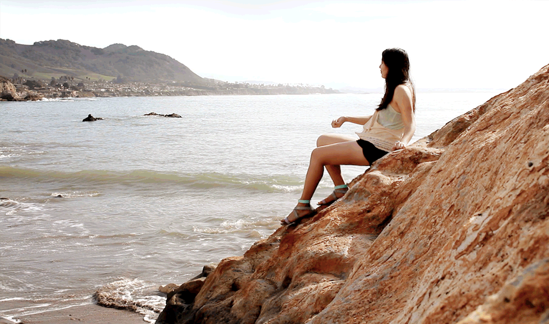
Since coming to SoCal makes it a mini destination wedding for the majority of our guests from the Bay Area, I wanted to create a guide for out-of-towners that showcases my hometown and its best qualities. We hope people can enjoy the entire trip outside of just the wedding itself, and experience all summer in LA has to offer ☀️ Here’s another photo carousel to break up the text, showcasing photos of us in the beautiful locations themselves.
Registry and more
This may be just a website, but if you’re ever planned a wedding, you know there’s a thousand more steps to finish before completing the site. Booking the hotel block, creating the registry (harder than it seems), writing out RSVP questions, finding a reliable system to host the RSVP with name-matching, linking it all, QA-ing everything before guests get confused or stuck, the list goes on.
When it came to the logistics and boring stuff, I was more than happy to outsource to third party solutions. I ended up using withjoy.com to host the registry and RSVPs, because they’d already built out these incredibly specific wedding features. There’s no need to build any of that from scratch.
Building the Site
When I first opened the Webflow interface, it hit me how little I knew. The learning curve was real. I pored over all the content on Webflow University for days, and learned about the box model, classes, and how HTML and CSS come together to create responsive sites. Being exposed to the full suite of interaction and animation features opened up a whole new world for me to dream about all the possible ways I could incorporate gamification through gifs, hover animations, and moving elements.
After all these years of relying on engineers to build, I felt so powerful knowing that I could finally design AND bring my designs to life. No more negotiating and simplifying visions down into MVPs. I hacked and learned as quickly as I can to build my minimum loveable product, even if it involves borrowing others’ code. (That’s literally what software engineering is, isn’t it?) It was honestly so exciting to take joy in the smallest of successes, like troubleshooting an element that refuses to work. This was the same stuff that got me excited at 9 years old when I made my first animation on Flash. The freedom to bring my vision to life, and literally make something just for fun.
Ultimately, although building the site was the bigger challenge for me, design (and content) is still king. Design is the vision that makes an idea come to life in the first place, telling the story through words and visuals. And the fact that, when needed, I can supplement my UI design with my own writing, illustrations, photographs, and films, because it’s what I’ve been practicing all my life. I love what I do, and I’m lucky to have put in the work to build up the skills to create in so many mediums.
Now that I’m back on Squarespace, I seriously miss all the personalization available with Webflow. Switching costs are too large for a service/platform I’ve invested 9+ years in, but maybe one day… For now I’m more focused on the content than building the site itself. The medium shouldn’t distract from the work.
Not to derail, but I’m noticing a growing sentiment where many people in tech just want to quit their cushy jobs to build video games full time. I think it’s because we much rather design and build experiences that delight humans than bring value to stakeholders. We’re so tired of privatizing, capitalizing, and monetizing everything on the internet — but that’s a conversation for another time. Anyway, I’m looking for my next opportunity to build something fun for an audience. And my next opportunity to buy more URLs! Hit me up if you want to play.
Password: obispo

Pushing the limits of a familiar design tool and playing with animation.