
The Art of Printing: Risograph Experiments

Drawing an iconic outfit of mine in the style of illustrator Mats Gustafson. Perfect decor to sit atop my dresser.
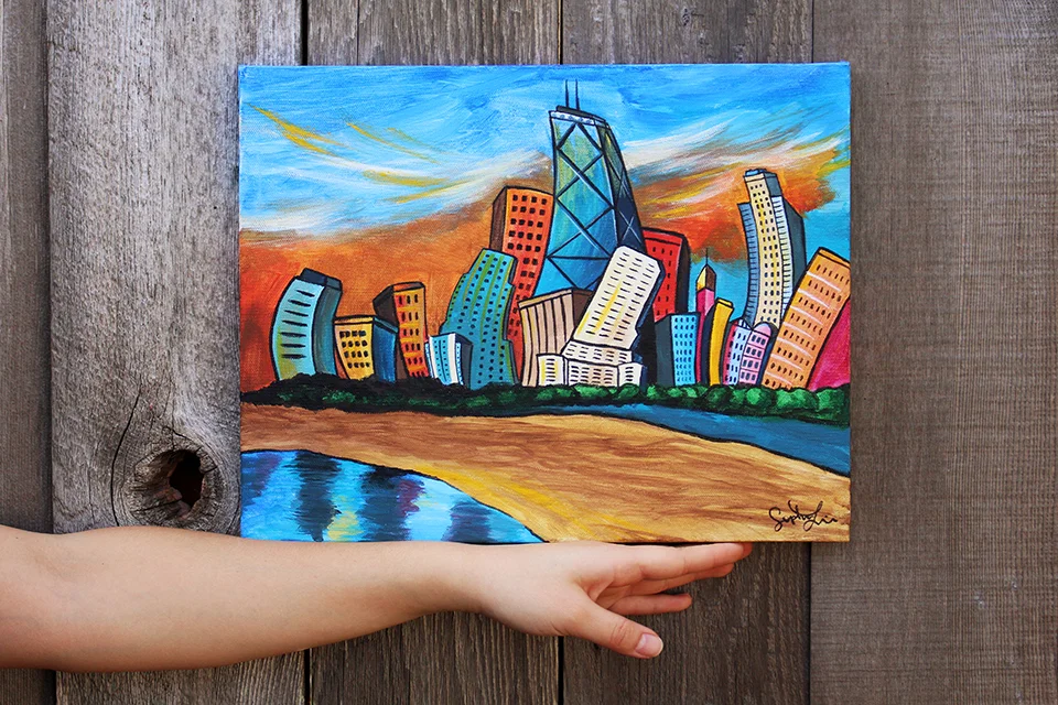
Ever since I moved into my new place last year, I’ve been on a mission to decorate my walls with art. I’ve always envisioned living in a space surrounded by beautiful things that spark creativity. And in gathering inspiration from home decor stores and the internet, I’ve been disappointed by the amount of boring minimalist abstract ink squiggles that sit on the walls of every interior design “transformation” and home decor catalog. If this is indeed my home, the art I display is going to have meaning. And what has more meaning than something I make myself?
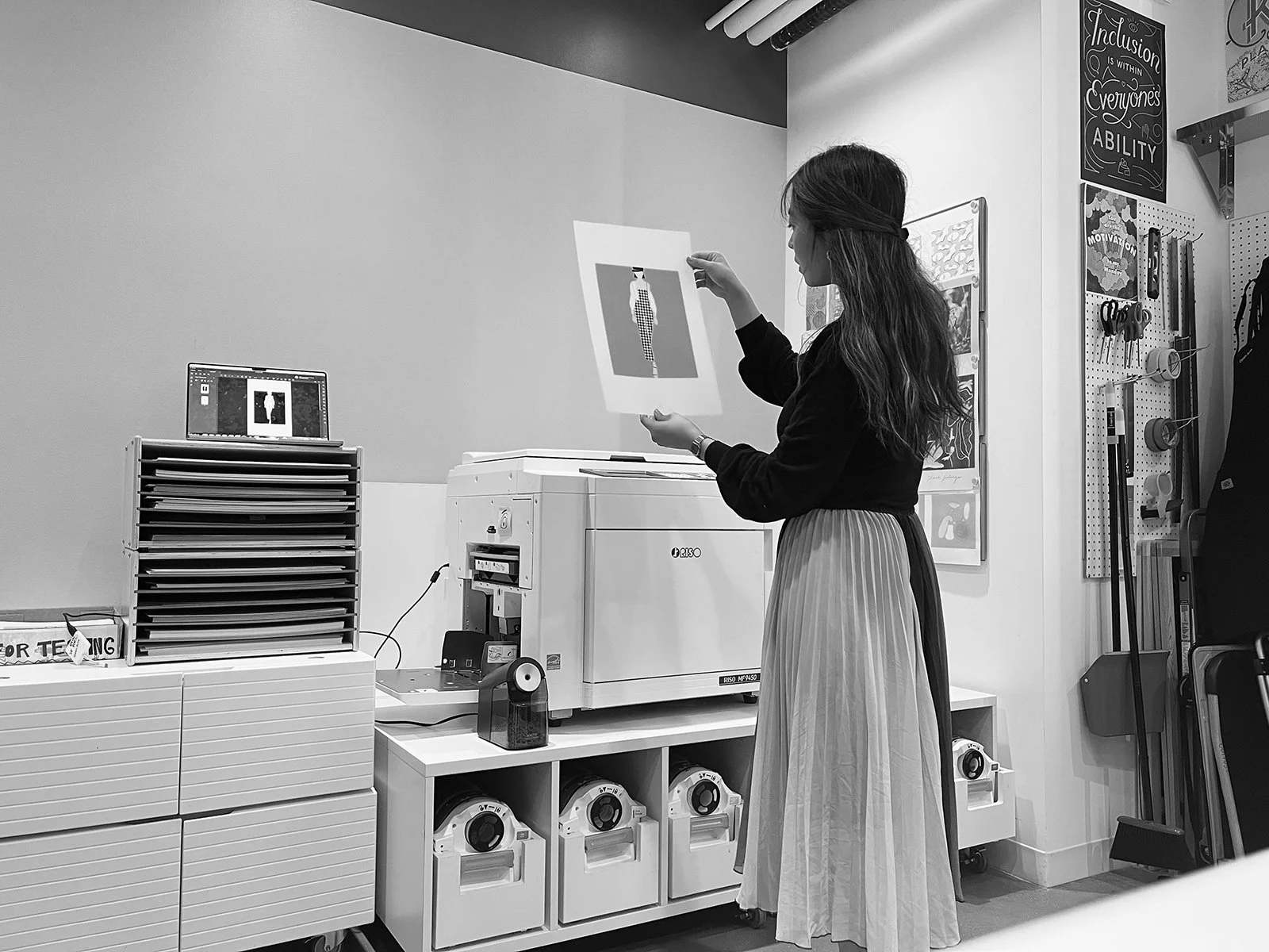
A lovely afternoon at the office accompanied by my new favorite printer.
Enter the risograph. Meta/Facebook used to have an artist residency program that invited professional artists to come in and create art for our offices — murals, installations, posters, and more — that liven up the workspaces and promote a culture of creativity and exploration. Even though the program is no longer around, many of the tools these artists used are still sitting in arts labs around different campuses. I enrolled in a risograph class and learned all about ink drums, making masters, and layering colors. And I became obsessed.

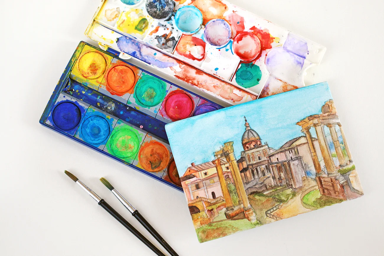
Color choices… how do I work with a limited palette of vibrant colors?
The digital vector illustrations I typically create are pixel perfect, but lack a human touch, a quality of imperfection. The risograph is an imperfect printer, and was exactly what I needed to experiment and replicate these grungy, vintage textures that feel so unique and one-of-a-kind. (Seriously, every print that shoots out of the printer has something off about it, but over time you learn to embrace it.) As someone who spends way too much time in a digital world where flaws literally aren’t possible, I love seeing small ink blots, misaligned layers, and grainy coverage.
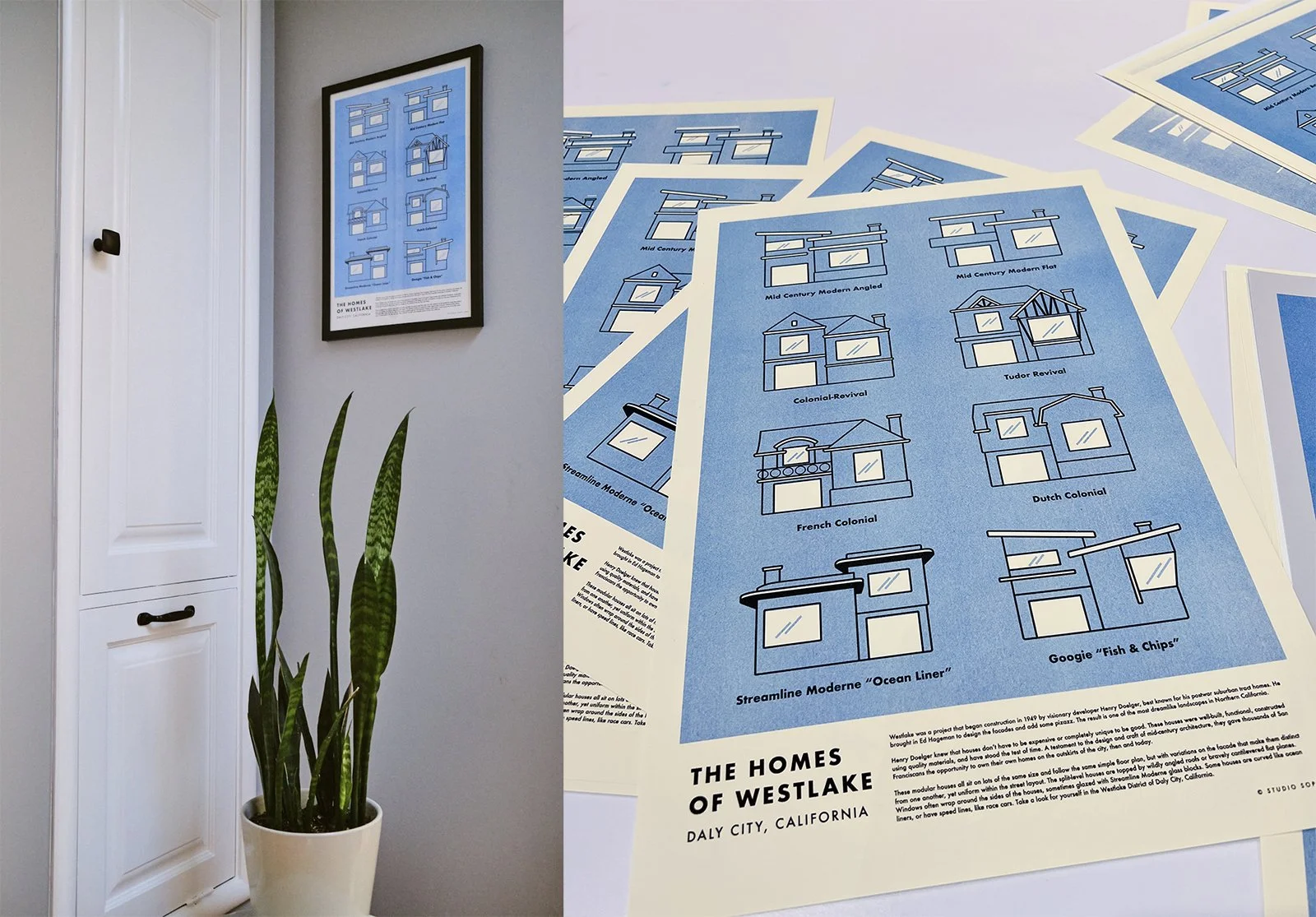
My first print! I made this poster out of the houses I’d drawn for my modular design case study project. It hangs outside my bathroom, to give those waiting something to look at.
One downside to the printer is a color limit. Because you can only have two ink drums at the same time, the fewer amount of colors you use, the easier it will be to print. For each design, I’m trying to limit my palette to two — unfortunately black counts as a color — and experiment with opacities to create different shades of the same color. I’m also learning to work with colors I usually stay away from (i.e. fluorescent pink, mint — ahhh!)

Our kitchen ABC’s. Drawn on Procreate, laid out on Figma, and printed via risograph. Can you guess all the things?
Printing your art is different. I always thought it was only a thing “real” artists did because they sold their art at fairs. But now I get to make unique prints to decorate my house. Art for myself is art at its purest.

Currently: Drawing and handprinting our Christmas cards. Feels much more personal than sending a boring printed photo.


A documentation of my 4-year-long interior design process, and a lesson in slow decorating.